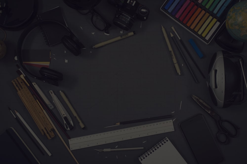
Seeing the word “hero” may give you more of an idea of fictional heroes such as Batman, Superman, or other graphic novel characters, but we’re not talking about heroes like Iron Man, My Idol, and Spider-Man, in fact, the word “hero.” “It has a completely different meaning for web design.
“Hero” in website design consists of a background, an image, a headline, a subtitle, and in some versions with one or two word text.
Thanks to the larger screen and the use of higher bandwidth, the use of large images in web design has become one of the most up-to-date and popular website design techniques in recent years.
Table of Contents
Use large images (hero header) in website design
Today, web designers use an attractive and impressive image with text in a larger size without compromising the speed of website loading. Given that the “hero image” is the first thing you see on the site, use it in the design of the site and pay attention to a few basic points, including transparency, image clarity and do not use blurry and crowded images, causes the following:
- On the one hand, users are interested in viewing the site.
- On the other hand, they will have a clear picture of your website in mind.
Tips for using HERO HEADER in website design
When designing a website using a hero header, there are several things to keep in mind, the most important of which are the following:
- Use large image or video as background
- Use the main title in a part of the background with the appropriate font
- Use short text and avoid cluttering the image
- Use super bold titles
- Use thin fonts for multi-line text
- Observe the space between the letters in the titles with thick font
- Use thick and thin fonts together
- Add some colors to single word words
Use buttons with beautiful and attractive forms
Be careful in choosing colors. If you are using a color image, make the rest of the area white or black. If the image is black and white, use monochrome coloring for the text at the top of the site. Place your text in the background so that the images are not visible. You need to use attractive and bold fonts to convey your message to users. Use uppercase and lowercase letters. This increases the readability of the text. All writings must be legible to be effective. Placing a transparent button with a flat design in the header increases the beauty of the header on the one hand and the convenience of users on the other.
Finding the best place for the menu in the “hero image” and using the fixed menu in this type of site design, allows users to easily and by clicking around the page without missing the opportunity to navigate to other parts of the page.
The location of the text, buttons and other design elements should be such that it does not cover an important part of the photo, such as a human face or branded products.
