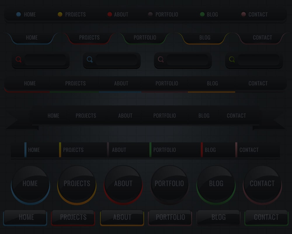
If you were looking at the blog section of our website yesterday, we have published an article entitled Menu Features in Web Design. In this article, we tried to tell you three of these features, which briefly included the following:
- Make the site menu available to the user
- Always place menus in a fixed place
- website menu items should be clear and explicit
Today we want to tell you the final two of these features. Stay with us.
Minimize website menu topics
When designing your website menu, do your best to minimize the number of menu items on your site instead of giving users too many options. Most users will not feel comfortable entering a website that offers a dozen different topics in their menu to click on.
In fact, according to reviews, the maximum number of main topics that are placed in the site menu is better not to exceed 7. In fact, according to short-term memory scientists, humans can usually store up to 7 items, and using this in web design and menus can help improve site usage and ultimately improve site SEO.
Using drop-down menus is very helpful on websites where there are many items to introduce to the user. The user hovers the mouse pointer over one of the main subjects and subdivisions of that item are displayed to him. Recently, the use of mega menus in site design has become very common, which is mostly used to design large store sites such as Amazon; In this way, by selecting a branch, its sub-branches appear in large size, which sometimes takes up half of the page, along with the photo, and helps the user to find the product or topic he wants.
Of course, using these menus and other drop-down menus with many items in the design of non-store websites may carry this risk; For example, the existence of multiple submenus causes the main and more important pages of the site to be hidden from the user and his attention is focused more on submenus.
Design the website so that the user knows where it is
When a website visitor leaves the home page and enters one of the internal pages, the website should be designed to show him exactly where the site is located. A fixed method can be used to determine the user’s current location; It is as if the appearance or color of the item changed slightly. If the website has more than one group and subgroup, make sure that the user can return to the higher group with one click at any time. One of the best methods, especially in designing an online store site, is to use Breadcrumb in the upper part of the website, which shows the user’s position to him at any time and allows him to go to higher groups.
